Advertisements


Sherwin-Williams predicts a return to richer, more personal interiors inspired by nature, craftsmanship, and homes that tell a story. Here’s how you can use it to bring a new look into your own spaces.
Written by Josh Walker
Sometimes it feels like white walls and soft greiges have dominated residential interiors. Sure, those particular hues offer a clean, timeless backdrop that works with pretty much every style. They’re your classic grocery-getter sedan. They’re khaki pants and a white blouse. They keep their heads down and get the job done. But if Sherwin-Williams’ newly released 2027 Colormix Forecast is any indication, a more adventurous tide is rising.
Lucky for us, Charleston has already been living that philosophy for centuries. Sherwin-Williams actually offers a dedicated Colors of Historic Charleston collection. It’s a 48-color palette developed with preservationists and approved by the city’s Board of Architectural Review. Rather than chasing passing trends, the collection draws inspiration from Charleston’s historic homes, gardens, and architectural details, translating centuries of Lowcountry design into colors that remain remarkably relevant today.
You can check out those swatches here, but let’s talk about what’s to come and how this year’s forecasted colors can make your interiors tell a richer story. Appropriately titled Rewild, it introduces 48 curated colors designed to be mixed, layered, and personalized. The message is, homes are becoming less about following rules and more about reflecting the people who live in them. Just look at our previous cover stars.

Cabinets by Carpet Baggers | Photography by Ruta Smith
Heritage, But Warmer
One particular design story celebrates craftsmanship and history. Think clay colors, aged wood, warm whites, oxblood reds, and finishes that feel collected rather than manufactured.
In Charleston, this trend feels especially at home. Historic architecture already embraces layered materials like heart pine floors, antique brick, plaster walls, unlacquered brass, and handcrafted millwork. Rather than feeling old-fashioned, these richer colors make traditional details feel fresh again.

Furniture by Seawah Furniture and Design | Photography by Tim Nelson
Nature Moves Indoors
Nature continues to influence interiors, but in a more sophisticated way than the sage-green craze of recent years.
Sherwin-Williams’ “Reconnect” palette leans into mossy greens, earthy browns, muted blues, and weathered neutrals inspired by forests, stone, and changing landscapes. The colors are meant to create the same feeling of calm and connection you’d find in nature.
For Lowcountry homes, these hues pair naturally with marsh views, oak canopies, oyster shell accents, and natural materials already common throughout the region.
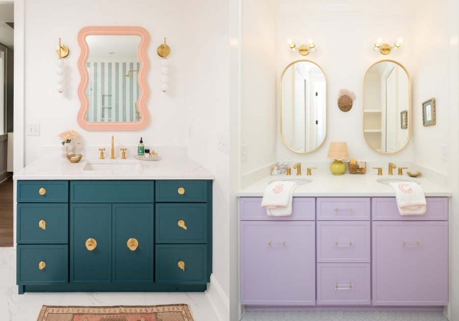
Cabinets by Mulberry Millworks | Photography by Kelly Parrish
Color Is Back
Maybe, as the headline not-so-subtly suggests, the biggest takeaway from the forecast is that homeowners no longer have to play it safe indoors. Instead of painting every room some version of a neutral, designers are embracing spaces with distinct personalities. A dramatic powder room. A deep blue study. A burgundy dining room. A moss-green pantry.
The goal isn’t simply to make a statement; it’s to create rooms people feel and remember.

Design by Joy Architecture | Photography by Ruta Smith
How to Try the Trend Without Repainting Everything
Sherwin-Williams’ forecast encourages homeowners to experiment in smaller ways first. A painted kitchen island, built-in cabinetry, a mudroom, or even a powder room can introduce richer color without overwhelming a space. Layering those colors with natural wood, stone, linen, and brass creates depth while still feeling timeless.
But if there’s one message behind Sherwin-Williams’ 2027 forecast, it’s that the era of perfectly coordinated homes may be giving way to something more personal.
For more home + design help, check out our Home Professionals Page.


Advertisements




Website Development & Hosting by: Colophon
© Copyright 2026 Charleston Home + Design Magazine. All rights reserved.