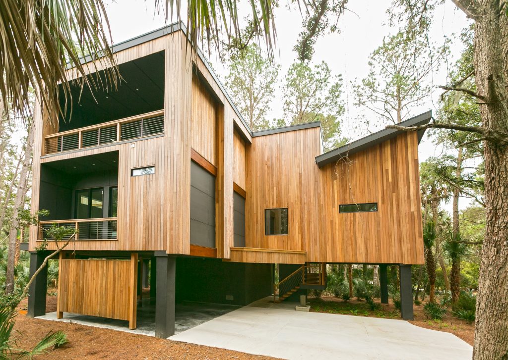
Welcome back to another episode of Brilliant Builders & Renovation Sensations hosted by Charleston Home + Design magazine publisher Tim Barkley. For this episode, we went on location to Kiawah Island where builders Kara and Neal Crowell of Cinder Creek Construction have completed their newest project – a contemporary home surrounded by nature.
We finished this home in October of 2020.
It is a contemporary, modernist home with a lot of elements from the midcentury movement – a lot of use of natural materials and a good flow of nature. It’s definitely different.
There’s not and that was very intentional. We wanted to give the impression that the house was meant to be in this lot. We cleared the bare minimum. The species are all native to South Carolina to encourage nesting for the species on Kiawah – bobcats specifically.
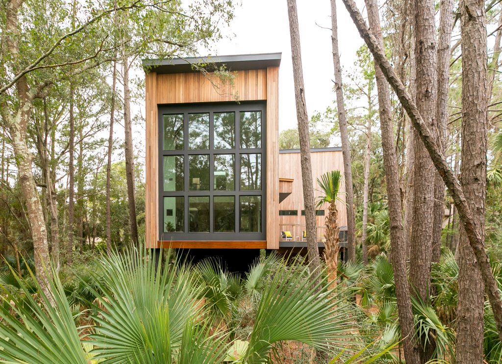
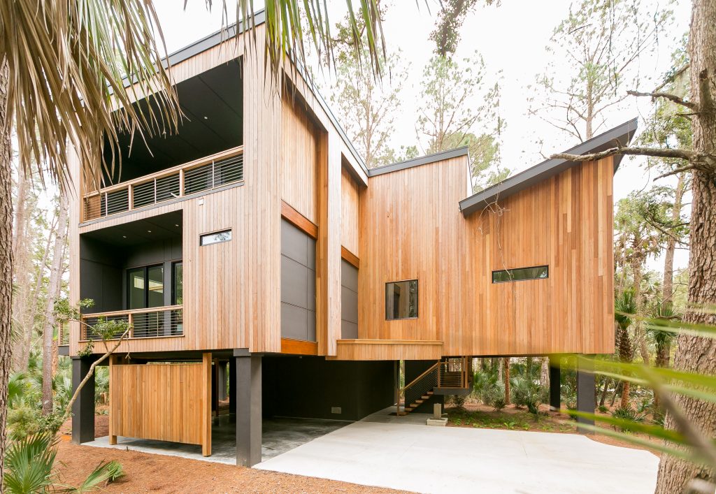
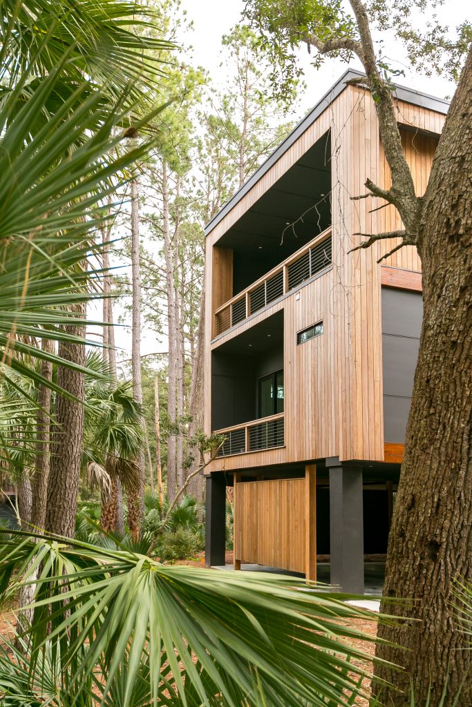
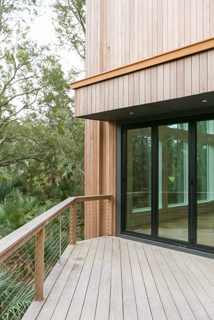
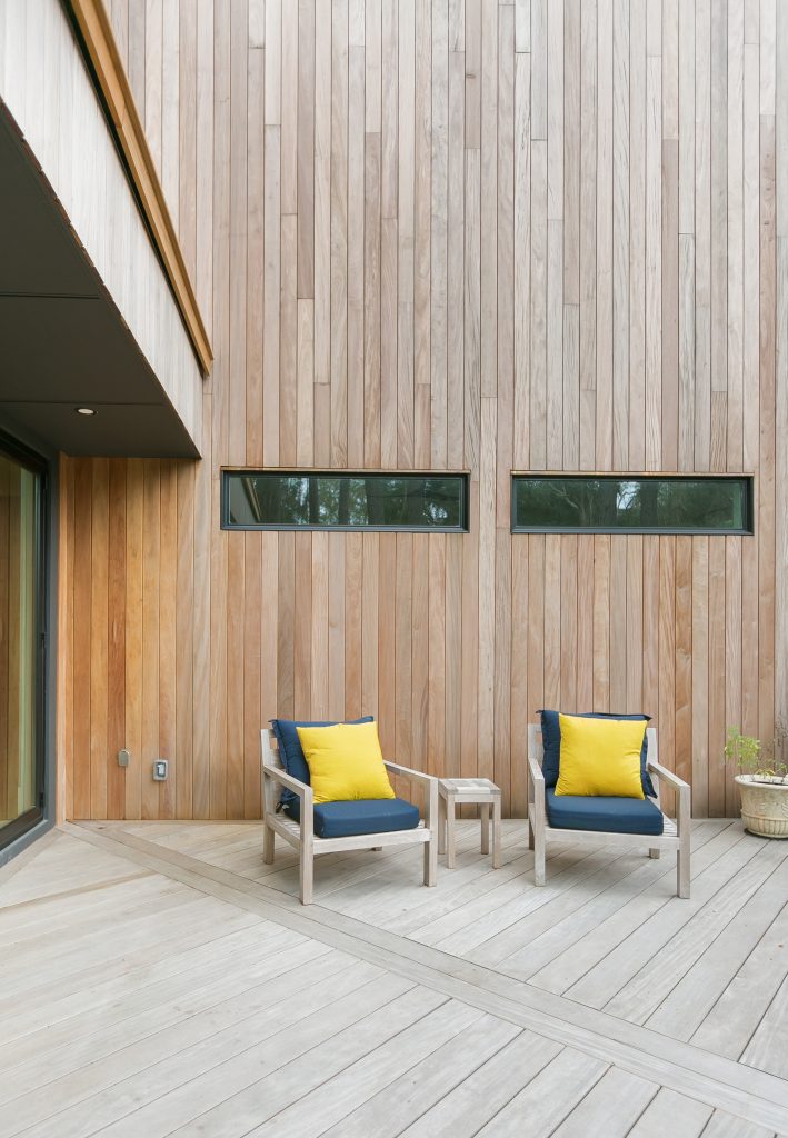
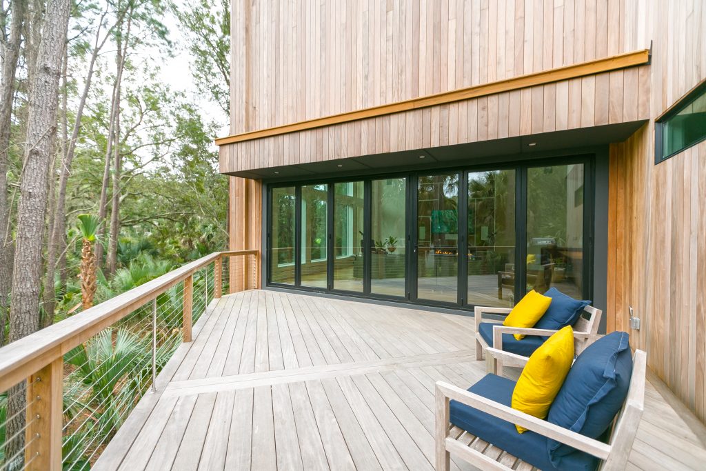
This contemporary home is anchored with a central core. Flanking out from that core are different elements that really make it stand out. The areas that extend from the central core have wide open areas underneath with plantings. The house is clad in garapa siding that weathers naturally. There are unique elevations in the roof, and the front and rear of the home have window walls to further bring the natural maritime forest views inside.
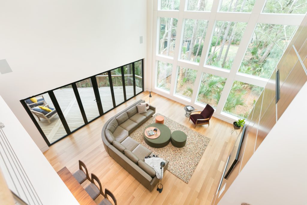
That’s correct. The window walls on the front and rear are fixed and very much like what you would see commerically. They were all custom-made, impact glass made by Andersen Windows. The geometric shapes and sizes were created to work with the elevation of the home. There’s not a single opening window in the house. All of the bedrooms have sliding glass doors and private porches. That enabled us to have fixed windows that provided the contemporary home aesthetic and natural light wanted.
There isn’t an HVAC equipment stand seen in this home like there are in many of the homes seen in this area. This particular home has a dedicated mechanical room on the second floor for the indoor portion of the air handlers, then hidden on the roof is a high-quality Mitsubishi system that has been very efficient for the homeowners. The homeowners are running about $230/month for their 3,300 square foot home. This is also an all foam insulation, a mix of open cell and closed cell. Closed is used on the bottom and the roof and walls are open. A lot of that is because the home has a steel skeleton frame in order to have those big open spaces so it took a remarkable amount of engineering.
This contemporary home is also a smart house so everything in the house is low-voltage, high-efficiency. When you enter a room the lights will come on automatically and then they time out, so you don’t have a lot of that uneccessary energy usage from people going in and out. Humidity is also a huge issue, especially in bathrooms. It’s pretty common people don’t run the bath fans for long enough. With this system, when the humidity reaches a certain level the bath fans automatically come on and will stay on until the humidity level has dropped. What that does is help exit the humidity from the room and prevent mold and mildew.
They’re designed to be cantilevered stairs so they have steel beam supports and are wrapped in the garapa wood. The steel landing platform is hanging from the main portion of the house. Because it doesn’t have the traditional supports, it does have open air. We’ve noticed people pausing the first time they come to the house and then stepping up – it’s sort of a visual trick. But, yes, everything was very much intentional. Steel beams come down from the column in the middle and the wood portion of the treads are anchored.
That was very intentional. A lot of the homes that were looked at for guidance through the architectural process had that same feel. The owners wanted the sense of it being a little bit darker like the foundation, then you come up into the small foyer and when you walk into the main area the massing in the main areas opens back up and takes you visually back outside. Well into construction there was a very interesting article that we came across and we learned that Frank Lloyd Wright used this concept in many of his homes – a smaller foyer with lower ceilings and then it opening up in the living area.
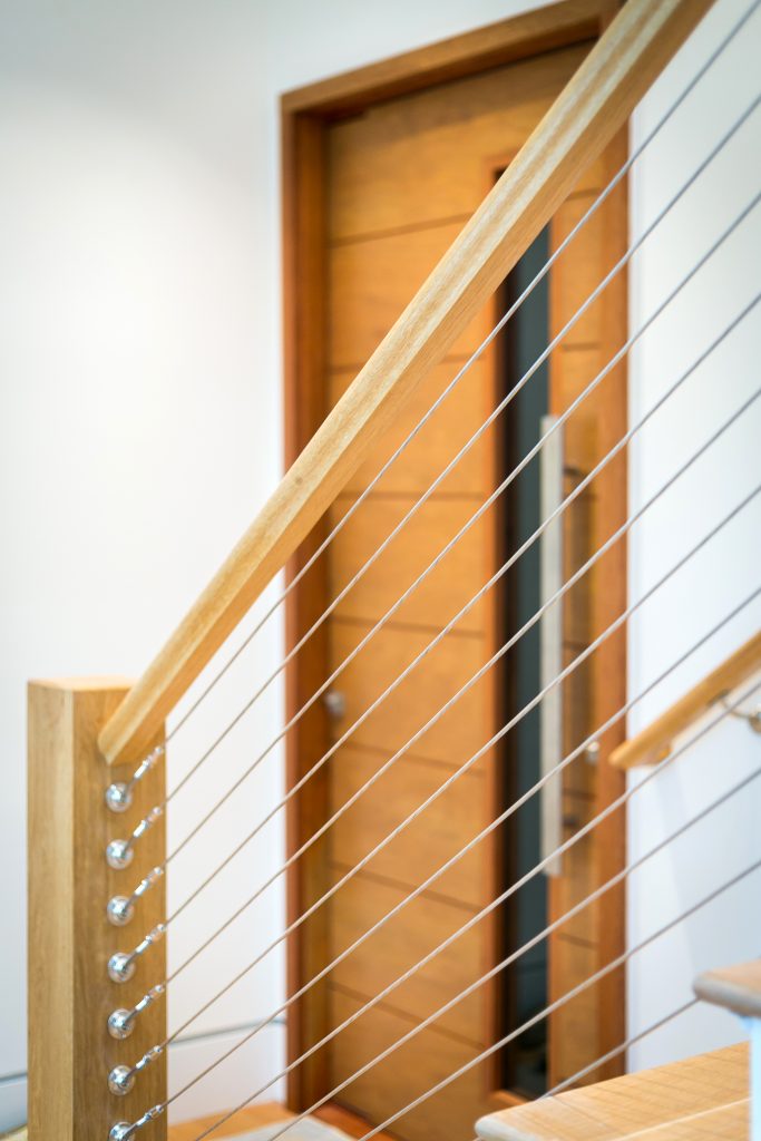
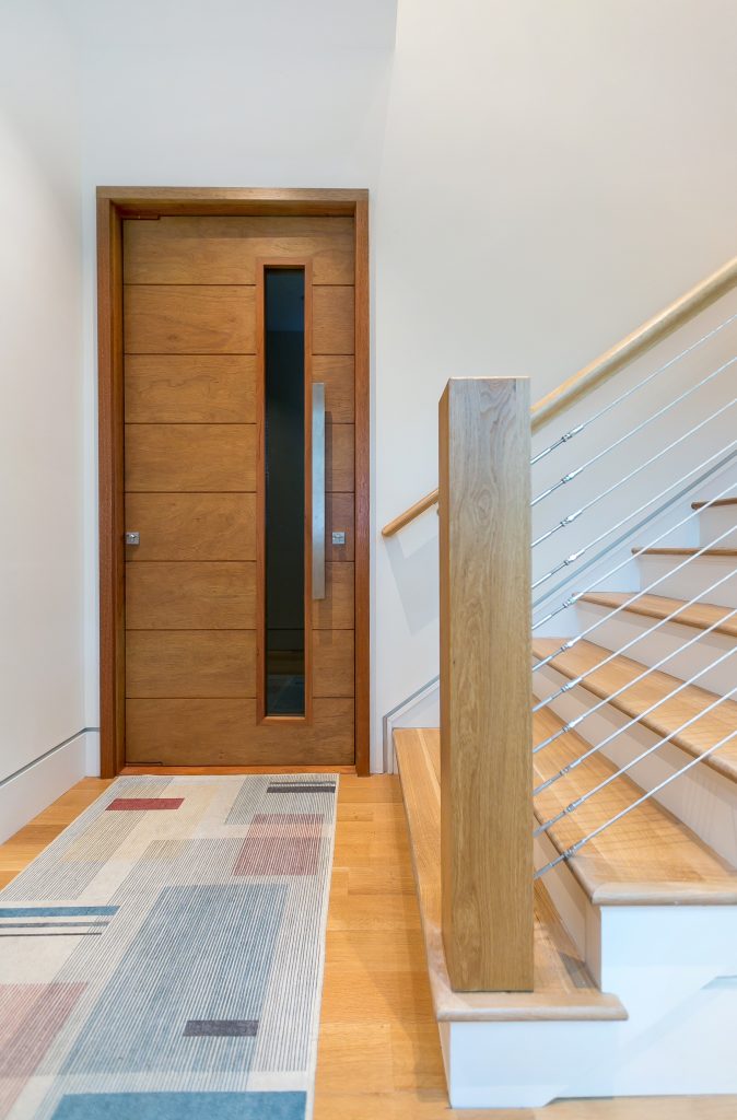
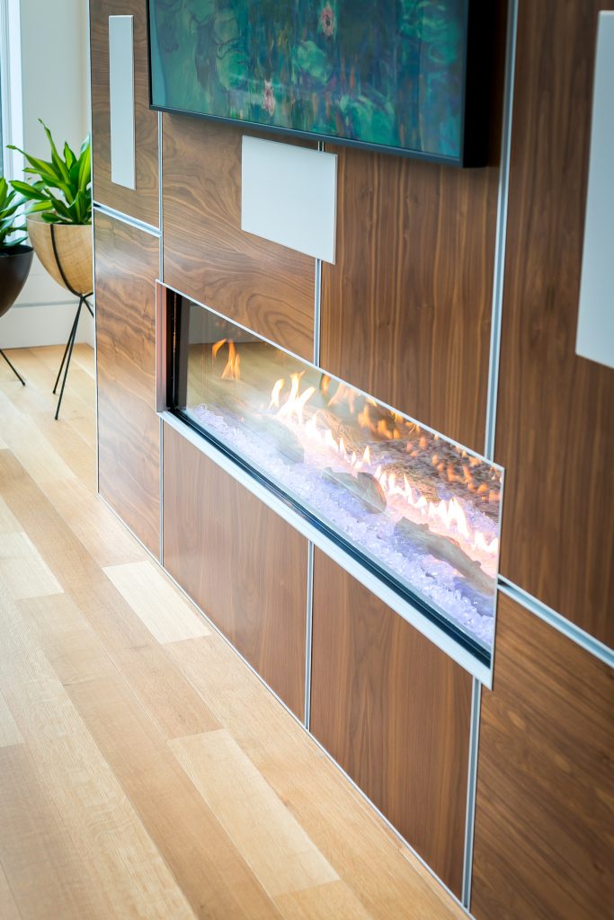
When you enter the main living area of the house, that same central core we talked about outside is on the inside as well, but this time it’s a central core with walls of walnut that wrap around hidden doors for the laundry room, and a future elevator. The doors are magnetic push handles, the commercial version for that panel. The smart home panel is hidden here as well.
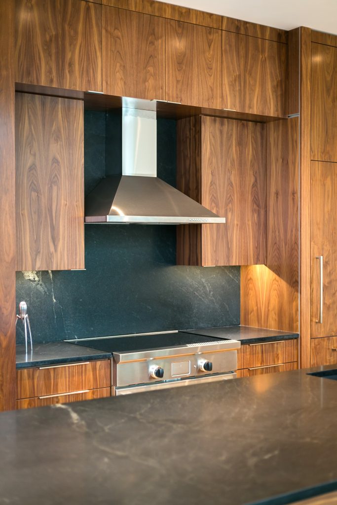
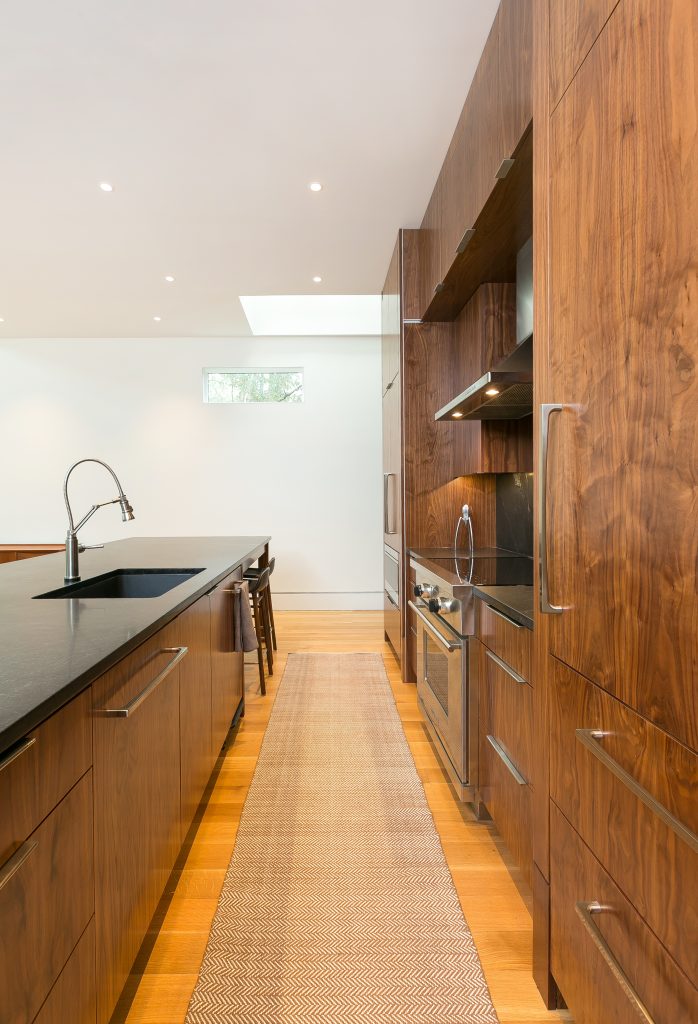
The kitchen is finished in walnut, flat panel cabinetry. There are 10 foot ceilings and the stainless detailing on the cabinets is seen throughout the house. The cabinet maker integrated those details in so it all tied together. He had some leeway to use his creativity here.
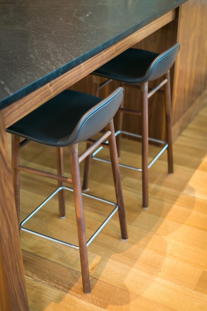
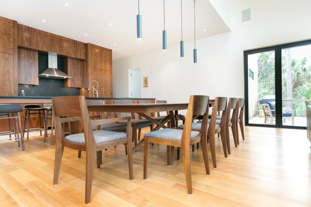
I believe they’re about 28 feet.
It is an accordion door so the entire thing will open up. It’s really easy to get open. It’s a 21 foot opening system that I can push open with one hand. A steel beam was recessed into the floor because the systems have a large track, so we created a smoother transition. If you’re stepping across barefoot, it isn’t as much of a tripping issue.
A lot of those details are builder driven. That’s where it’s important for homeowners to get their design team together early on in the process so the builder can weigh in on functionality of those decisions. And so they can get in early enough to make those adjustments.
Again going with the influence of the old-school, American, modern, very simplistic and similar colorways that you would see outdoors. The homeowner worked with Iola Modern in North Charleston to furnish the living room.
The piece that looks like artwork on the fireplace is the Panasonic frame TV. I am hesitant to put televisions over the fireplace because it disrupts the seamless look. This particular television is so minimal which is exactly what the homeowners wanted.

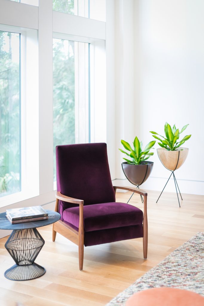
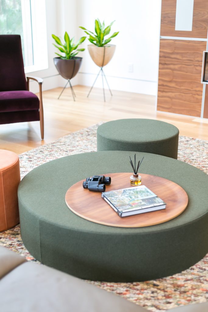
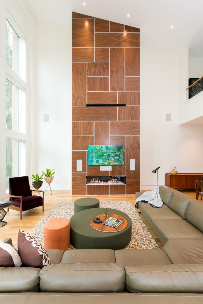
We didn’t use any window treatments in the entire house because they weren’t needed. You get privacy from the forest rather than needing draperies, which goes back to maintaining those clean lines.
The morning light is the homeowner’s favorite. We saw how that early morning light came in and it’s not a glare where window treatments are necessary. The windows are very efficient so we don’t have to worry about needing something else.
The natural wood runs throughout the house so it’s consistent. We wanted to see the different variations in the wood. The bedroom has two sliding glass doors leading to a breakfast porch. The view of the maritime forest can be enjoyed from the porch.
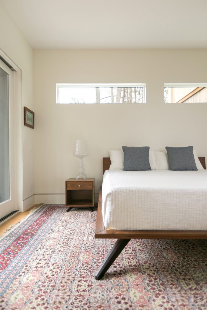
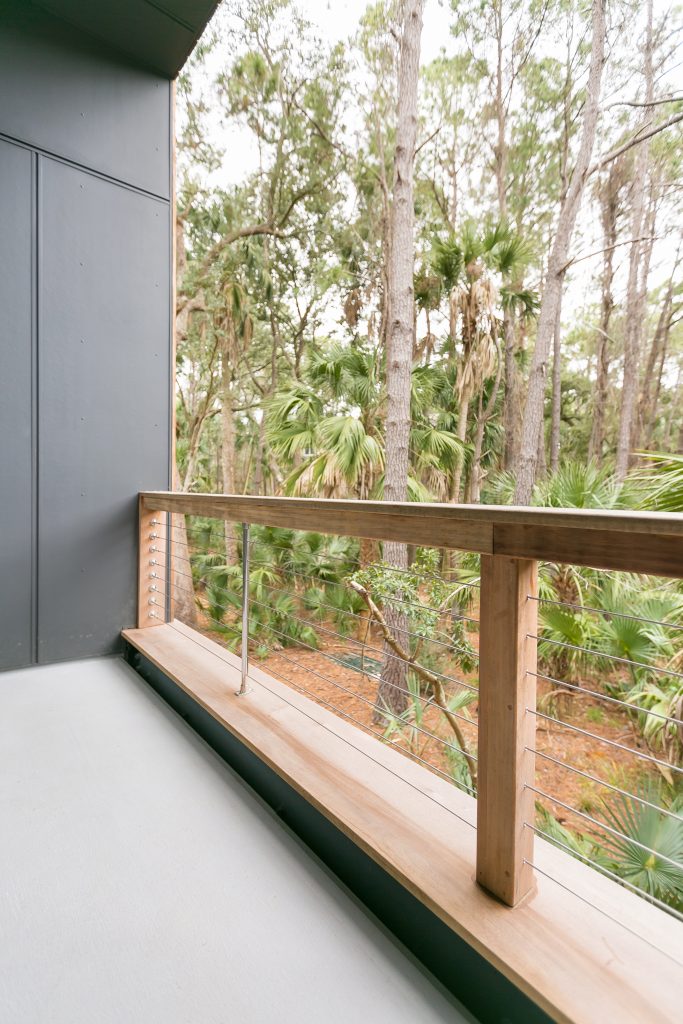
The unique shape of the lot allowed us to be very intentional about where the house was sided. We didn’t want to disturb anything that didn’t absolutely need to be. Looking out of the master bedroom, the lot actually extends out even further so all of that will always stay natural. This allows for better water drainage. There are setbacks from the back porch, and the owners could have built further back from another angle, but the intent was not for a larger home, they wanted something compact.
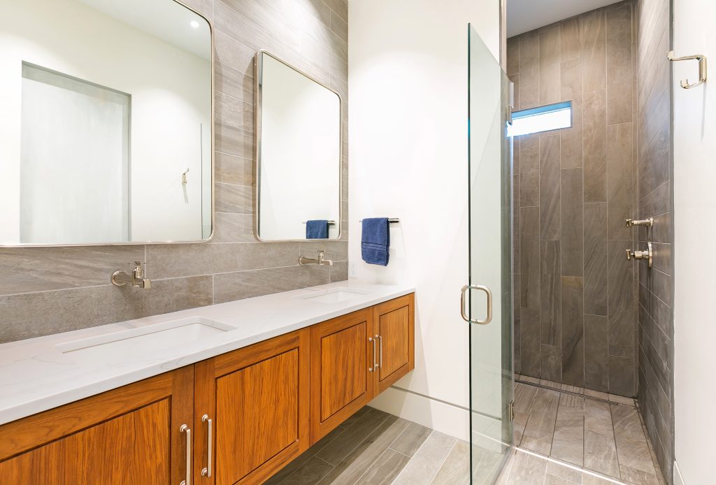
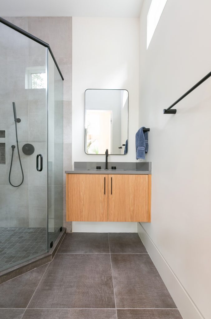
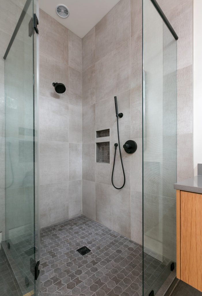
The owners didn’t want a huge master bath, so this space is very straightforward for them. Our cabinet craftsman had some creative liberty and designed a custom teak floating vanity. A man-made quartz countertop and one tile style kept the space seamless and organic. The beauty is in the simplicity of the design; we let the architecture speak for itself.
These types of doors are called a couple of different things – minimalist frames or modern frame or frameless. The intent is for the door to disappear into the wall so your eye just flows right past it. The same concept was used with the baseboard which is recessed into the wall and has a reglet detail that runs along. The idea is to keep everything nice and flush without the extra ornamentation.
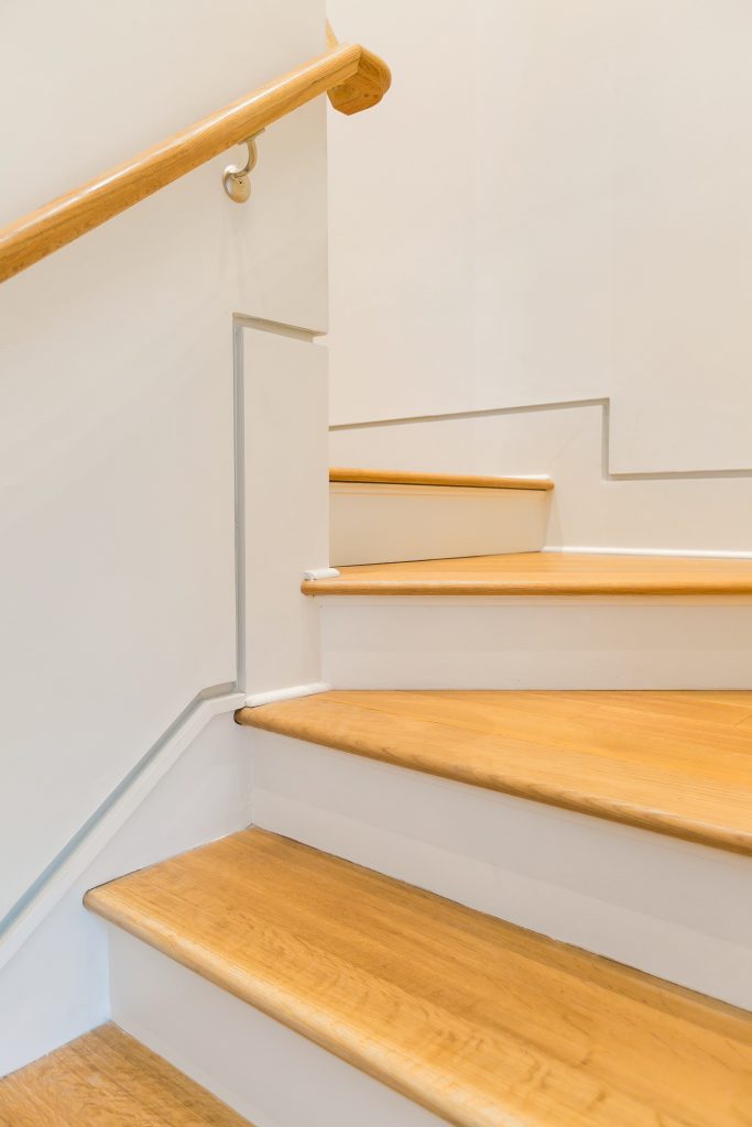
Every project is different so it depends on the client and what they’re looking for. In this home we used flat, but it most cases, our clients use eggshell. We used a flat finish here because we wanted something that was going to absorb light a bit better. The walls have a very slight texture.
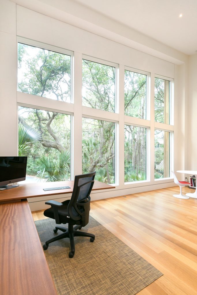
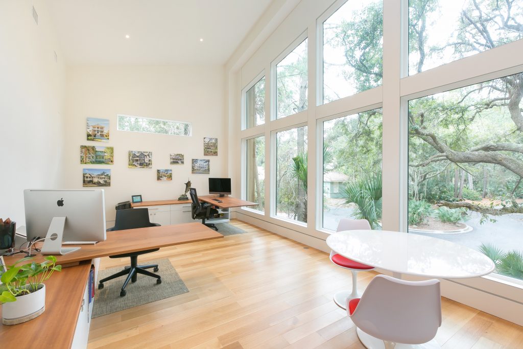
The homeowners use this space as a home office; it could be used as a den down the line. There’s an angle to the ceiling in this room. In order to remain consistent with the design of the rest of the contemporary home, a minimalistic approach was used. What’s nice is when you’re sitting in this room, because of the way it is sided and the architecture of the home, you can only see a little bit of one house. If you’re on the main wall, you don’t see another residence so it’s still remarkably private.
This room doesn’t have any window treatments, like the rest of the home, but since the space is only used during the day, privacy isn’t as much of a concern. The window wall allows you to see the neighborhood aligator and brings the maritime forest views inside. This room also has a full bathroom.
For more information, call Cinder Creek Construction at (843) 768-0784 or visit cindercreek.net and be sure to keep an eye out for Kara’s interview on Brilliant Builders & Renovations Sensations to learn more about this contemporary home.
